I have to confess that I was not enthralled when I first saw the new In Colors. What went through my head was… “why are there TWO greens?” and “another pink? we don’t need another bright pink”. This isn’t usually my reaction to the In Color changeover but I was especially annoyed about it this year. I think the biggest reason is that I’m REALLY missing Seaside Spray, one of my favorite colors of all time. I also really wanted to have another blue in the mix since we lost one. Another factor (I’m sure) is that I’m just kinda cranky in general from a year+ of solitude and isolation. I miss my peeps, and I’m looking forward to in-person crafting again, hopefully very soon.
However, I’m warming up to the new colors. I knew immediately that I would LOVE Pale Papaya, and I really do. It is a nice, soft orange that adds something wonderful to our color collection. I think that I’ll reach for this color a bunch over the two years that we get to create with it. And I’m warming up to the two greens, so .stay tuned to see what I make with them.
On a different topic, this is the first time that I’ve played with the Welcoming Window bundle, and I really like it a lot. The larger window images weren’t a great fit for what I wanted to do with this card, but the great thing is that there are some great images that are beautiful on their own. I look forward to pulling out this set and doing more with the window stamps and dies for future creations. I’ve seen some really stunning sample online created with this bundle, and I’m so glad that it carried over into the “big” catalog.

It is obvious that I used this sketch challenge as the inspiration for the layout of my card. This sketch is something that is right up my alley, and I knew that I had to make a submission as soon as I saw the sketch. I can totally see swapping the DSP and white space for another creation, so don’t be surprised if you see something like that here. 😊

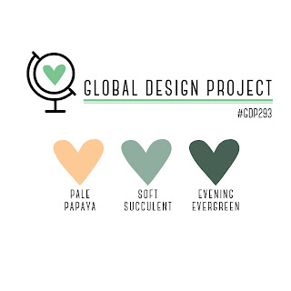
I didn’t pick the colors for my card randomly, this current challenge from the Global Design Project is my inspiration for the colors on this card. I really like these colors together, so I’m very glad that this challenge gave me an occasion to use them.
The pretty Pansy Petals DSP includes these challenge colors, so there are some great coordination options. I was drawn to the paper because there are several “B-sides” that are gingham pattern which I dearly love. I confess that the paper that I used for my card is one of my least favorite in the pack, but I think it was perfect for this card.


Love that wonderful paper with the softness of the flowers. Great take on the sketch. So glad you joined us at the Paper Players this week
jaydee
Thank you so much jaydee – I had fun with the challenge and I really appreciate your kind words!
Beautiful, Andrea! I love the pitcher of flowers backed against this die cut. I have to confess that I was smitten with the new In Colors immediately. But like you, I really miss Seaside Spray. I was so sad to say good-by to it. I love Soft Succulent and Evening Evergreen paired with each other. They look fabulous on your card! Thank you for playing with The Paper Players this week!
Thank you so much Ann – I’m so glad that you like the colors on my card and your kind words brightened my day!
Girl! I was the same exact way about these new In Colors! I was all ” we already have SO many greens!” lol! I’m warming up to them too and actually like the Soft Succulent a lot right now! You’ve used the colors wonderfully here and I love how you highlighted one of the smaller images from this set. Not everything needs to be a window! Great job iwth the sketch! Thanks for sharing at The Paper Players!
Thanks so much Amanda – it’s great to hear that I’m not alone in my initial reaction! I’m warming up to them too, and I look forward to using them again in a future challenge from The Paper Players.