
I just heard a story on the radio about home-grown fireworks in New York City, and I saw a video online about a man who shot off fireworks in Brooklyn that went into a house and set it on fire. It sounds like things have gotten a little crazy on that front! Most of the fireworks displays and parades around here aren’t happening this year. In many communities these events pull people together in close proximity which isn’t safe right now. My hometown of Essex is one of those that have cancelled the fireworks this year. It totally makes sense, but my heart is heavy for the companies that provide these displays – this must be quite a hit to their bottom line. But the 4th of July is still a holiday – are you doing anything (safely) to celebrate? At this point we don’t have any plans since we are staying close to home for the most part. Creating this card is likely the extent of my celebration this year – and that is really ok.
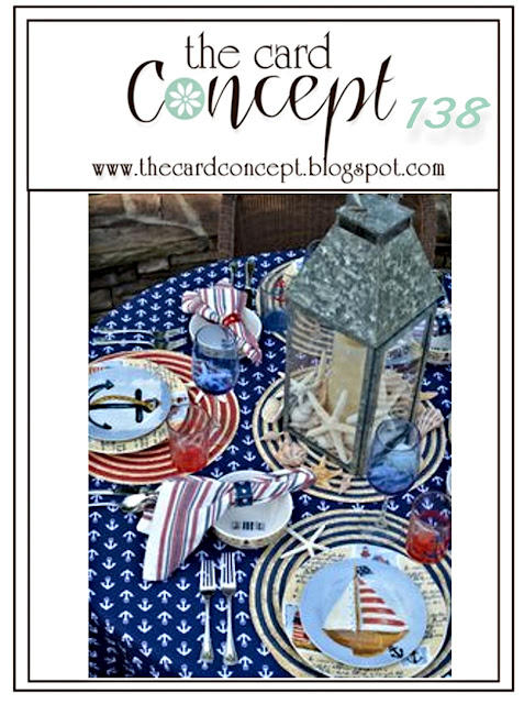
This is the first time that I’m participating on a challenge from The Card Concept. I just discovered this challenge blog a couple of weeks ago and I’m so glad to participate for the first time. The inspiration that I took from the photo was the color scheme – red, white, and shades of blue which I used to create my Clean and Layered card. At first I was thinking of going full nautical since I have some wonderful stamp sets that I can use for that purpose. But then it occurred to me in the shower (some of the best ideas happen in the shower) that these colors are perfect for a 4th of July card. And then I was off and running!
FYI – I dug deep into my retired paper stash to find the red paper that you see on the card. I didn’t have anything from the currently available products that would work to fit the color scheme I wanted. So, you won’t see this paper in the list of products below.

I drew the design layout inspiration from this Retro challenge from CAS(E) this Sketch. They have brought back a layout from a long time ago, to inspire us for the next week. I really like the visual impact of the diagonal element on this design. I moved the location of the sentiment a little bit because I found that the stamping didn’t show up well enough on the patterned paper. It really is a very small change from the layout, so I hope that you can see the sketch in my card design.
 | |||


Wonderful, patriotic card and I can definitely see our inspiration photo in it. We are so glad you found us and look forward to more of your beautiful work! The Card Concept Team!
Thank you so much Anita – I look forward to participating in future challenges from The Card Concept Team!