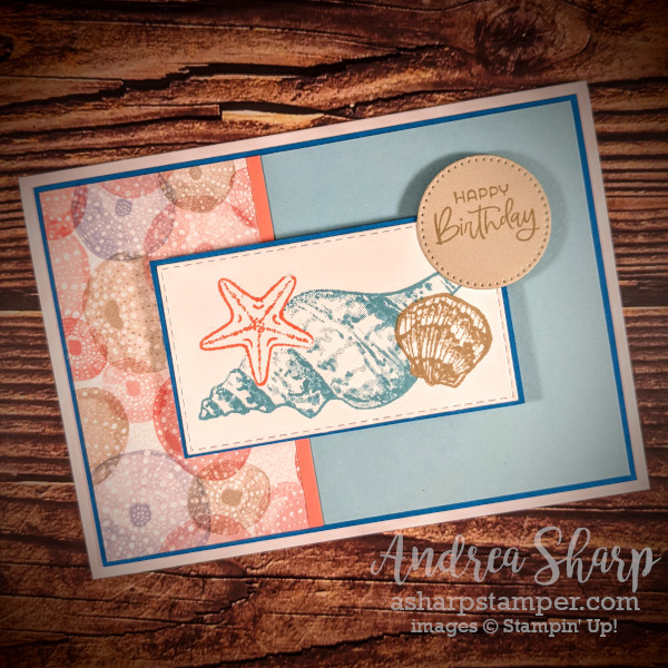
I’ve been working on a batch of 35 of these cards this week. It’s that time of the month again where I need to whip up a large batch of birthday cards for our church card ministry. The number needed varies each month and it turns out that August is a “medium” month for birthday volume. Since it is the last real summer month here in VT, I saw this as my last chance to create a card with a beachy vibe. I have a pack of the Sand and Sea patterned paper in my stash of retired paper and it seemed like a perfect opportunity to use some of it. Two sheets of those pretty urchins (I think they’re urchins 🤷) was just the amount that I needed for the mass production of this card. I really hope that the recipients enjoy receiving them this month!
I know that I’ve mentioned this before, but you need to be strategic when you are doing mass production of any project. As always, the Stamparatus was absolutely essential to pulling this off, especially when you want to line up multiple images consistently. I do have to say that I think I might have changed my strategy for masking of the images. Let me tell you why. I decided to have the starfish and the scallop shell in the foreground so that they would pop in comparison with the large shell image in the back. Well, it turns out that the arms of the starfish are small and narrow enough that after a few stampings the mask would tear. So I had to recreate that mask a few times while I stamped that focal image. I think if I had instead masked the large shell along with the scallop, I would have avoided that problem. However… that would mean that I would be stamping the panel 3 times instead of 2 (I could stamp the scallop and starfish at the same time), which would take longer. Given that trade-off, I think I’m still happy with my choice.

I used this old sketch as the design inspiration for my card. It’s a pretty simple layout, and the panel on the left is absolutely perfect for including some great patterned paper. Honestly, the trickiest thing was figuring out what to do with the “any shape” star. It feels a little weird to stick something willy-nilly up in that corner. I do think that a small circle with the greeting isn’t as conspicuously weird as some other shape would be. I’m still totally in love with the Stylish Shapes dies! I’m happy with how this design turned out – what do you think?


