I created this card when I was experimenting with the “Black Ice” technique. I discovered a video on YouTube showing how to do this technique, and I was blown away by the results that people are creating. I wanted to show this technique at stamp club, so I had to experiment so I could teach the gals (stay tuned for a future post with the card that we made in club). For this card I used the Champagne foil, but you can use any of the colors of Stampin’ Up! foil for the technique.
I apologize for the quality of the photo – I had to rush to grab one because I wanted to share this card with you before Sale-A-Bration (SAB) ends tomorrow. You see, the sentiment die is one of the free SAB options that you can choose with a qualifying order. This offering requires an order of at least $100 in merchandise to get it for free. I love using sentiment dies, and these are fantastic!
To create a thicker sentiment I attached adhesive paper to the back of three pieces of Calypso Coral cardstock and diecut the “amazing” sentiment from each. I peeled off the backing of the adhesive paper and built up the layers of the dies to create a single, thicker sentiment. Using the adhesive sheets makes working with word die cuts soooo much easier!
Here is an outline of how to do the “black ice” technique:
- On the foil piece, lightly drag the edge of your Basic Black (archival) ink pad from top to bottom. You’ll need to work in sections so that you can hold the foil still while you are dragging.
- Rotate the foil piece 180° and lightly drag the Basic Black pad from top to bottom. This way you’ll have streaks that are darkest at both the top and bottom of the foil.
- Stamp your line-art image in Basic Black ink. Be very careful when stamping because the foil is slippery and you can easily create a blurred image. That happened a little bit to me with this card here.
- Give a little blast of heat to fully dry the Basic Black ink so that it won’t smear when you’re working with it.
- Very lightly drag the edge of your Versamark pad over the top of the foil – again from top to bottom. You really have to use a light touch – the temptation is to push harder because it doesn’t glide easily. The light touch is key to getting the rough surface look that is part of the effect.
- Apply clear embossing powder over the surface and heat with your heat tool.
- Use your pretty art piece in your project and enjoy!
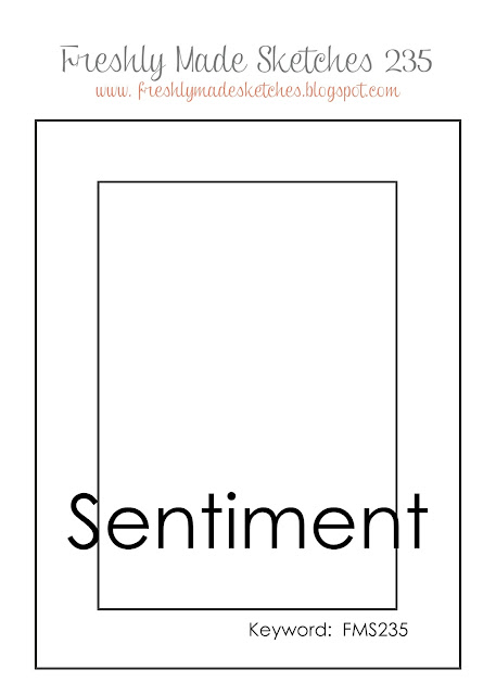 I used this sketch as the inspiration for the layout of this card. I wanted the art panel to be the focal point, and this sketch seemed to be just the ticket to accomplish that.
Product List

|

|

|
|

|

|