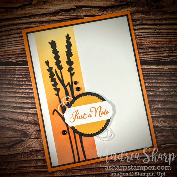
I signed up for a demonstrator swap to feature new stamp sets from the 2022-23 Annual catalog, and this is the first card that I designed for the swap. I knew right away when I looked at the catalog that I just HAD to buy the Go To Greetings stamp set. The versatility of this set is amazing, and I love the variety of fonts that the company used in the different options. There’s a lovely, large scripty font down the a small, cute whimsical font. The only font-style that I would have loved to have included would be a block-style font like a typewriter look. But we can’t have everything that we want! I still love this set, and I recognize that adding another font would have meant either charging more (boo) or offering less sentiments (double boo).
When I signed up for the swap, I had to indicate 3 options for stamp sets that I wanted to use. The great swap host makes sure that we have a nice variety of stamp sets represented which is one of the reasons that I love this specific swap. When she let me know that I could use my top 2 sets she did have a specific request for this set. Since it is a sentiment-only set, it is important to make sure that the greeting is prominent on the card. I told her that my plan was to use diecuts and no other stamps so that it’s clear that the sentiment is the star. This card is my final design following that guideline.
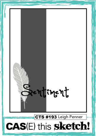
This old card sketch was the design inspiration for my card. I knew that I wanted to have an ombré background behind a silhouette diecut and this sketch was perfect for the vision that I had in mind. I also realized as I worked on this card that it was feeling a bit familiar, and then I remembered the card that I designed for stamp club a couple of months ago. You can check it out here so you can see what I mean. Clearly I’m drawn to this type of look since I’m repeating it without realizing it right away! 😎 I have to say don’t be surprised if you see this come up again in the future.
 |  |  | |
 |  |  |  |
 | |||
")