Last evening I got together with the South Burlington stamp club group. It was another great time with friends, and a distant member beamed in via Facetime. She was busily working on her own project while we worked on cards, and we had a great time visiting and sharing. We all have so much going on – an upcoming wedding, a looming first-time college drop-off, an unexpected death of a co-worker, in other words… life. It was so great to talk about all of these things among friends and feel connected to each other. I love spending crafting time together with these ladies!
This was the second, simpler card that we created last night. The trickiest part is all of the stamping on the focal flower cluster image. One thing to know about this stamp set is that the stamps that fill in the flowers and leaves aren’t a perfect fit – there will be white spaces and may go outside the lines a little. It’s all ok because it’s meant to be an artistic look, not an accurate natural image. I do have a tip to share for times when you’re using several colors of ink: stamp all of the images in one color and close that ink pad before moving on to the next. Open ink pads tend to be pretty dark and it is hard to tell differences in colors. This means it is easy to ink up a stamp with the wrong ink, with a bummer result – you may end up with purple leaves or green flowers. I have done this so many times, and I’m trying to be better about this to avoid the frustration. I hope my tip will help you avoid it, too.
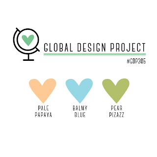
My inspiration for this card is the color challenge on the Global Design Project site. I knew right away that I wanted to use this stamp set for the challenge – I think it’s perfect to showcase 2 colors for flowers and Pear Pizzazz is a perfect fit for the leaves. I absolutely love this suite on page 104 of the annual catalog or online here.
I really like the challenges that are offered on the Global Design Project site. They have a regular rotation of different challenges: Color, Sketch, Theme or CASE the Designer. I love the variety, and the inspiration from the designers really is amazing. I’m so thankful that they do these challenges for us!
Updated August 24th – I’m super-excited to share that my card was selected as one of the “Special Mentions” for the challenge. This is a fantastic way to start my week!
Before I forget, I want to put in a plug for Sale-A-Bration (view here). The pretty paper that you see in the center of the card is one of the designs in the Beautifully Penned paper which is one of the Sale-A-Bration options currently available. The designs coordinate perfectly with the Hand-Penned Suite imagery and all designs are in black and white. This paper is one of my favorite freebies in this Sale-A-Bration, and I hope that you’ll get some for yourself.
Product List


I just love the combination of stripes, polka dots and flowers! Great card Andrea.
Thanks so much Kylie!!!