At the very end of May I made a batch of 33 of these cards featuring different colors in the Brights patterned paper. The birthday card ministry at our church needs cards every month, and I had to work quickly to get them to the coordinator in time. In fact… I had to deliver 3 cards from my stash to get her through the first 2 days of the month so they wouldn’t miss any birthdays. That allowed me to work on a weekend to create a batch of this card pictured here.
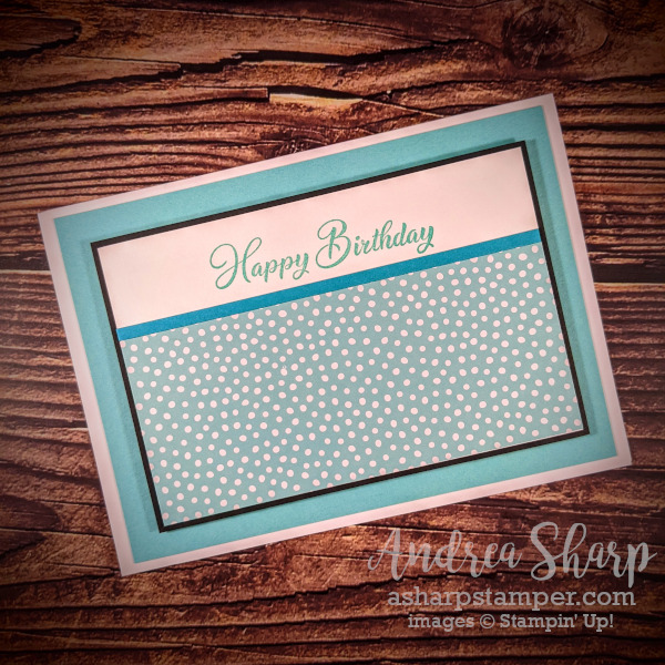
The paper that you see is retired from a couple of years ago, and I’ve provided a link below to the current paper. The colors are all the same, and you can follow this sample as a guide to create some of your own. I LOVE the diagonal plaid in the new paper, and can’t wait to play with some! I was very short on time this month, so I needed something that was SIMPLE and celebratory. I decided to use the pretty Brights paper because the colors are a wonderful, cheerful look for a birthday card. The wonderful fonts in the Go to Greetings stamp set was absolutely perfect for some simple stamping for these cards. I decided to go with monochromatic pairings for the thin strip between white and patterned paper and the black mat provides the pop to make it all stand out. Here are the color pairings that I used (the stamping matched the patterned paper color):
| Patterned Paper | Coordinating Strip |
| Coastal Cabana | Bermuda Bay |
| Daffodil Delight | Pumpkin Pie |
| Melon Mambo | Polished Pink |
| Mango Melody | Pumpkin Pie |
| Poppy Parade | Flirty Flamingo |
| Flirty Flamingo | Poppy Parade |
| Gorgeous Grape | Fresh Freesia |
| Granny Apple Green | Parakeet Party |
| Pacific Point | Balmy Blue |
| Bermuda Bay | Pool Party |
I hope that you’ll draw some inspiration for a simple stamping approach for mass production. And even more importantly, I hope that the June birthday people will enjoy receiving one of these cards.
Product List  | |||
 | |||
")
 Designer Series Paper")